Improving Shopper Engagement Through a Central Brand Hub
Timeline: 2 weeks
Role: UI/UX designer (Solo)
Tools: Figma
Context
Bicester Village is a popular destination for retail tourism in the UK, attracting hundreds of visitors daily to their luxury outlet stores.
Problem
Bicester Village visitors come with clear buying intentions, unlike typical luxury retail shoppers who often just browse.
However, shoppers who want to learn more about their favourite brands aren’t given comprehensive information through the app.
Goal
Introduce a new app flow that helps loyal and frequent visitors get a deeper insight into the brands they love.
Research
What are shoppers currently experiencing?
I interviewed 15 regular visitors to explore navigation patterns, identify potential pain points and learn about their shopping experiences. Unfortunately, feedback from the current app users were unavailable due to their reported technical issues.
Reoccurring themes
Whose perspective should I prioritise?
I created a user persona by leveraging my research and observations to guide my design choices.
How are other luxury retailers keeping their customers engaged?
By examining three popular luxury retailer apps, I identified the differences and similarities in their key features. Notably, Bicester Village, as an outlet, offers a unique experience as it doesn't feature the latest designs and lacks conventional online shopping.
To prioritise the users’ preferences over my own, I added a feedback column written from their perspective.
Summary
↩ Customers need an opportunity for exploration & consistent updates
😑 Lack of new items can create a negative experience
🔔 Notifications about relevant deals and new arrivals are desired
🤝 Build trust, familiarity, and consistent positive experiences to foster a loyal relationship
Solution
Upgrade the ‘Favourites’ feature with personalised settings and introduce dedicated brand pages, creating an engaging hub for users to stay informed about individual brands in the village.
User flow
Shortening the journey to your favourite brand, while extending the exploration beyond
It currently takes 3 clicks to navigate to their ‘favourite’ brand. However, once there, no additional features or functions are activated and no details about the brands’ stock are disclosed.
Current flow
New flow
Wireframes
After sketching, I created low-fidelity wireframes on Figma…
Wireframe 1st round
As I began to prepare for the high fidelity designs, I noticed some of the design elements needed to be refined.
Wireframe 2nd round
High fidelity designs
Adopting their visual identity
Since Bicester Village already has an app, I kept the visual identity to ensure cohesion throughout.
Further insider knowledge
I discussed this project with a Bicester Village employee for feedback. As a result, I was given further clarity about what differentiates the village from other retailers.
Insight - Some brands don’t have general ‘sales’, they’re called ‘special prices’ and apply to specific products. Bigger brands rarely participate in village-wide sales but, when they do, they require a minimum spend.
Changes:
Sections accessable on the brand page will vary depending on the running promotions
A promotional banner
‘Sales’ is now ‘Special prices’
Insight - Shops in the village rarely have ‘New in’ items, but when they do, a shop usually only have 3 - 5 pieces of a product.
Changes:
Changed the UI to focus one product at a time as the quantities a small
State how many are in stock to encourage a sense of urgency
Outcome
Keeping tabs on your favourite brands
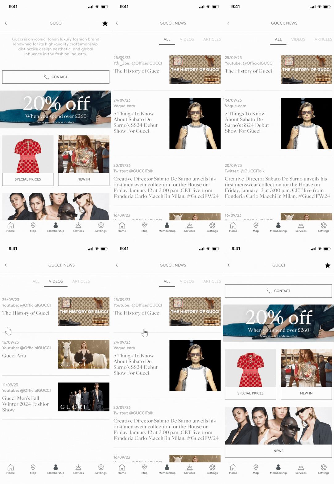
Access your favourites from the home page
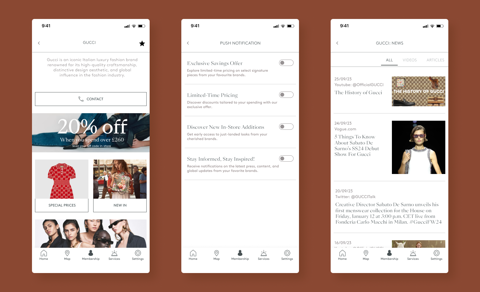
A dedicated brand page
Discounts!
Prepare yourself & your wallet for what to expect on your next trip to your favs
A tailored collection of press coverage from your favourite brand
And be the first to know about all of it!
Reflection
I’m happy with what was able to complete in a short timeframe
My initial concepts were derailed due to the information shared by the employee - I should have contacted them during the research phase of this project.
Referring to Emily’s ‘commentary’ (the user persona) throughout the process provided so much clarity!
I’ll revisit this project to give more time to smoother prototypes.
Next project


